Branding
Why Strong Visual Identity Drives Better Conversion
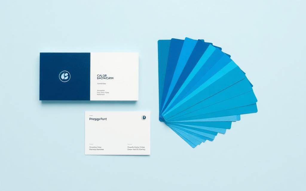
Branding is often filed under 'nice to have' until the numbers show otherwise. A coherent visual identity reduces the cognitive effort required to trust you, and lower effort means higher conversion.
Recognition is earned through repetition
People rarely convert on first contact. Across ads, social posts, landing pages, and email, a consistent palette, type system, and photographic style makes each touchpoint reinforce the last instead of starting from zero.
Design signals reliability
Visitors judge credibility in under a second, largely on visual cues: alignment, spacing, image quality, and clarity of hierarchy. A page that looks carefully made implies a company that works carefully.
A system beats a logo
A usable identity is a set of decisions your team can apply without asking a designer every time — colour roles, type scale, button styles, image treatment, and tone of voice.
- Define colour roles, not just colours
- Limit the type scale to what you actually use
- Document how photography should look
- Write three sentences describing your tone of voice
Key takeaway
Identity is a conversion asset. Build a system your whole team can apply, then apply it everywhere without exception.
Want this applied to your brand?
We work remotely with clients across Spain, Europe, and worldwide.